Great Eastern — Advisor Digital Portal
A vendor engagement. A shipped product. And what I'd do differently with fresh eyes.
In 2022, I was assigned to the Great Eastern ADP project through HCL — a 3-4 month engagement designing a digital profile platform for GE's financial advisers across Singapore. I was a vendor. My job was to execute the brief, not question it.
I executed. The product shipped. Advisers use it today.
But looking at it now, I can see the gap between what was built and what advisers actually need.
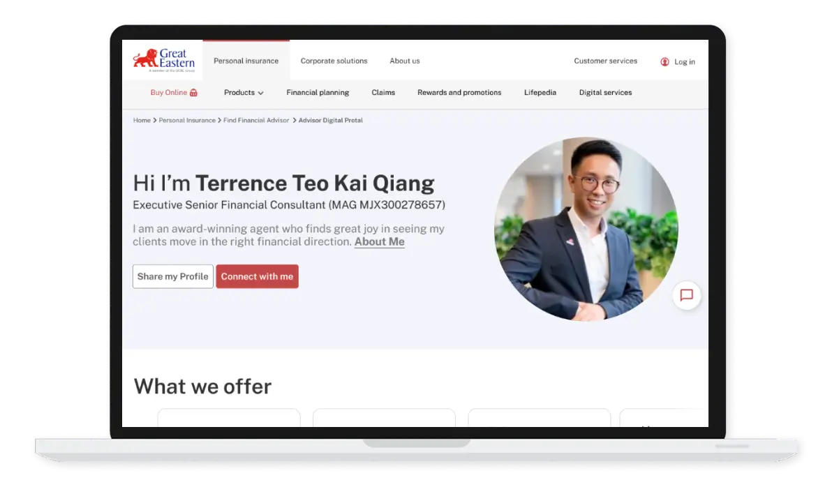
What I Built
The Context
Great Eastern needed a way for financial advisers to have a personalized digital presence — a profile page clients could visit, learn about the adviser, and make contact.
My role: Design the ADP theme. One template. One design language. Applied across hundreds of adviser profiles.
The team: HCL developers, GE Singapore stakeholders, a design system in Sketch (yes, Sketch — this was 2022).
The constraint: As a vendor, I operated within a defined brief. Feature requests came from GE stakeholders. My job was to design what was asked, validate with their team, and hand off to developers.
What Got Designed
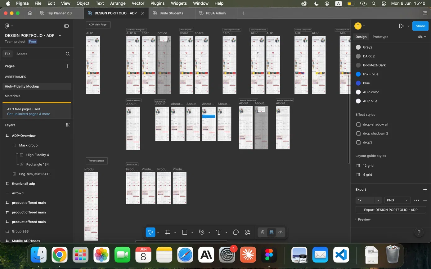
The ADP theme
- Agent profile card (photo, name, title, MAS registration number)
- Contact actions (Email, WhatsApp, Add Contact)
- What's New section (product campaign banners)
- Testimonials
- Featured Articles
- Deals and Events
- What We Offer (insurance category grid)
- Career Opportunities
The design system work
- Adapted GE's existing brand guidelines into component specs
- Worked within Sketch (the team's tool of choice at the time)
- Handed off to developers via Zeplin
User research happened — mostly around the CMS that agents use to manage their profiles. The feedback was difficult to action. Agents requested things like "make the logo bigger" in wireframes, or "add more language options." Reasonable asks individually, but not insights that changed the product direction.
The honest reflection: I had opinions about whether we were asking the right questions. But in a vendor role, working with Singapore enterprise stakeholders, you learn quickly which battles to pick. This wasn't one I could win.
Meanwhile, the UX brief included animated micro-interactions — a bouncing enquiry button. Agents don't care if the button bounces. They care if clients contact them. These are different problems. But when you're a vendor and the client wants a bouncing button, you design a bouncing button.
What The Live Product Looks Like
The ADP shipped. It's live. Agents use it.
What works
- WhatsApp contact is present and functional
- Testimonials give social proof
- Insurance categories are clearly organized
- Mobile-responsive layout
What doesn't
- Generic stock hero image (a hand holding a "Protect" block) — zero personality per agent
- Massive whitespace between sections (implementation gap)
- WhatsApp buried at the bottom of the contact row — not the hero CTA it should be
- Nine insurance categories shown with no filtering — clients still have to figure out which one applies to them
- No personalization — every agent's page looks identical except for the photo and name
The product is a digital business card. It tells you who the agent is. It doesn't help you find the right agent, or help the agent convert a visitor into a lead.
What I Actually Proposed (That Didn't Ship)
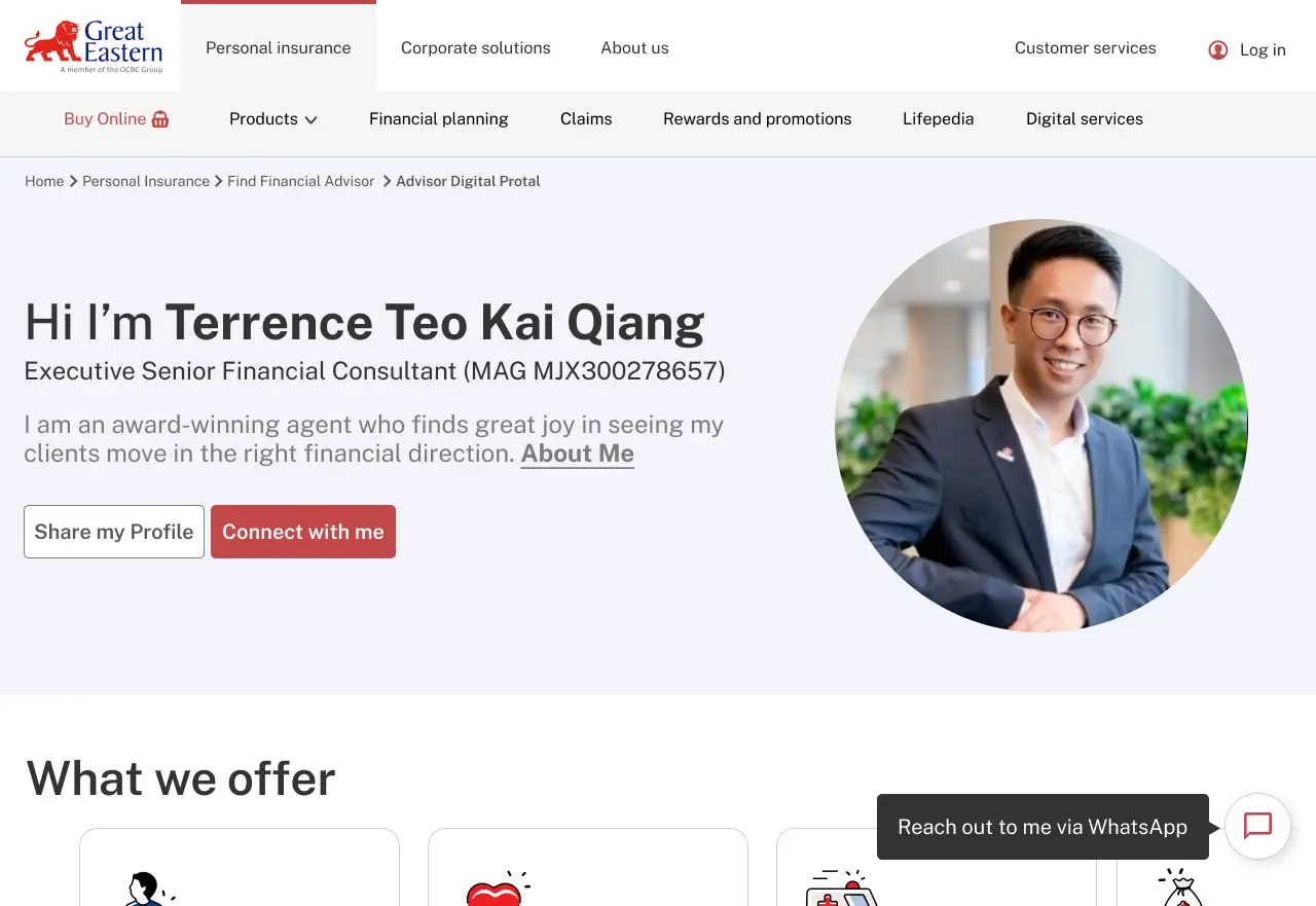
I designed a version where the agent was the hero.
Personal greeting. Prominent photo above fold. "Connect with me" as the primary CTA. Multi-channel floating bar (WhatsApp, Messenger, WeChat). No generic stock photo of someone holding a wooden block.
It didn't ship. Vendor role. Singapore corporate. The stakeholders preferred the original template direction.
The agents are still using the generic stock photo.
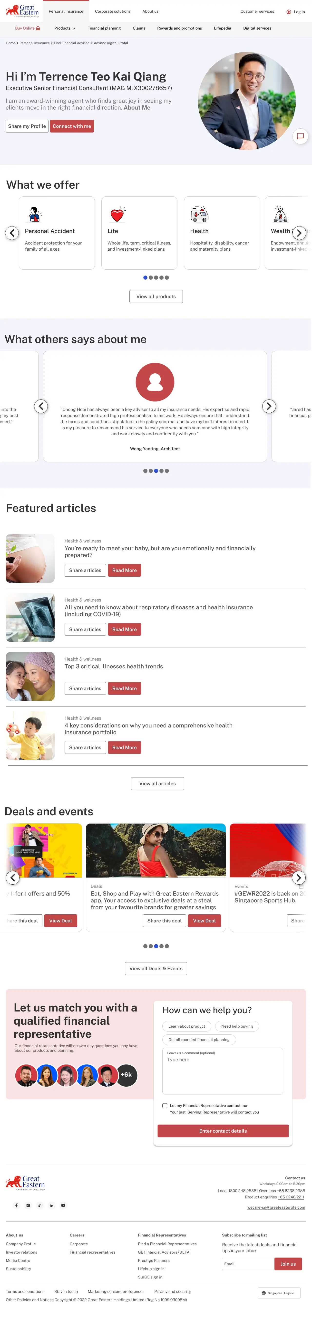
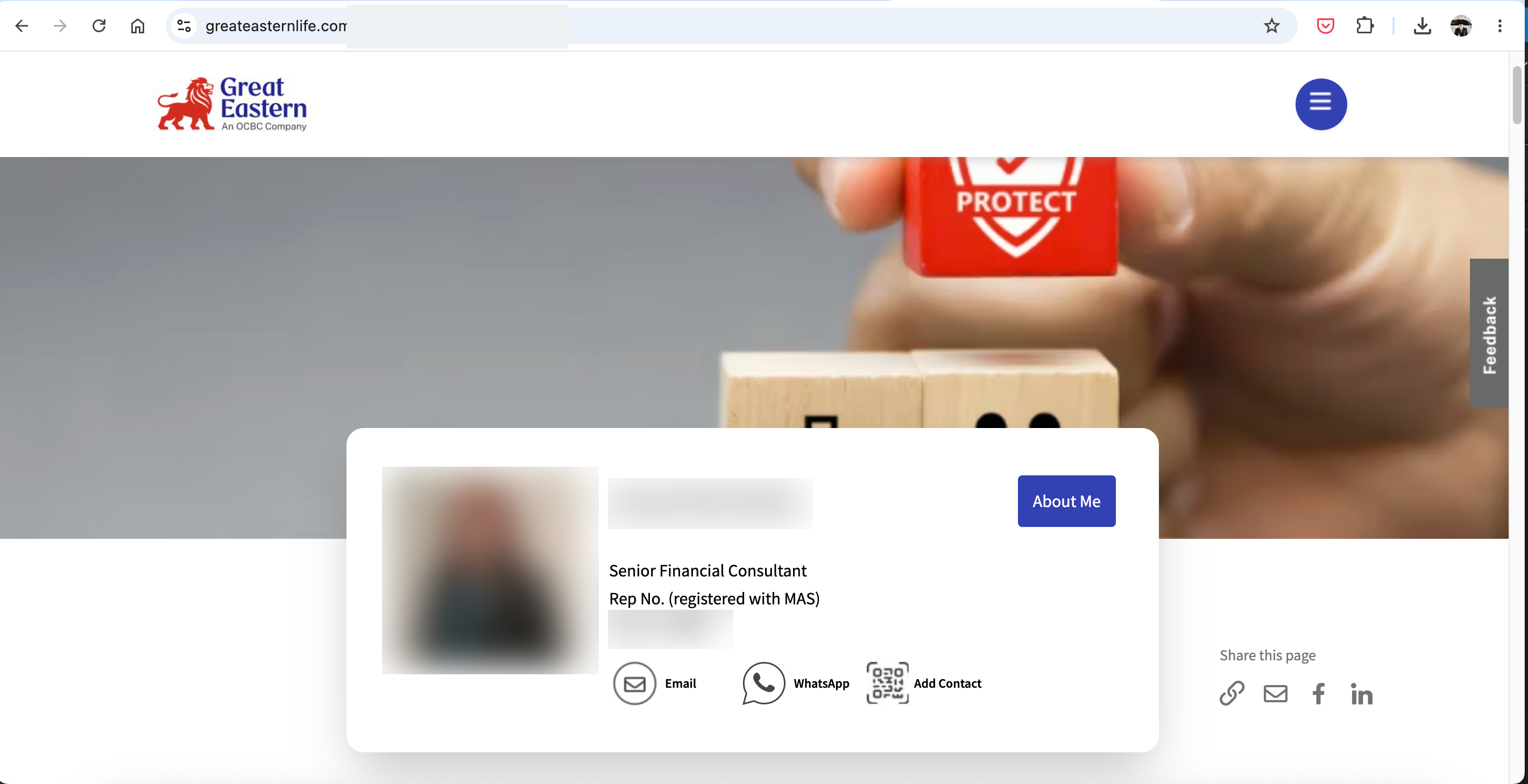
"Same template system. Two completely different outcomes. One where the agent is the hero. One where a hand holding a wooden block is."
The gap isn't the template. It's the decision about what matters most on the page.
What I'd Build Now
The Real Problem I Missed
The brief was: "Advisers need a digital profile."
The real problem was: "Clients don't know which adviser to contact, or why to contact this one specifically."
Those are different problems. I solved the first. The second was never addressed.
Kin is looking for car insurance. He lands on Jenny's page.
Jenny is a Senior Financial Consultant with 20+ years experience. She speaks Mandarin and English. She specializes in life and wealth products.
Kin needs car insurance. Jenny might not even handle car insurance.
But the page gives Kin no way to know that. He has to read through everything, figure it out himself, then decide whether to WhatsApp.
Most people don't. They leave.
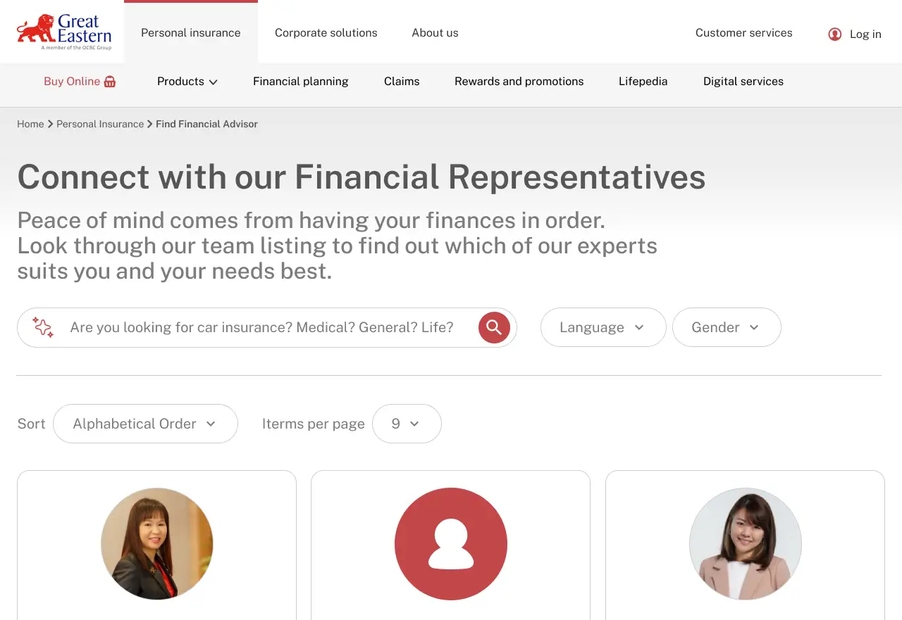
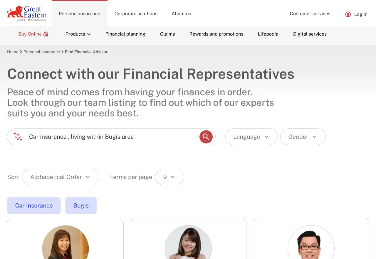
Enhancement 1: AI-Powered Agent Search
Instead of browsing individual profiles:
"What are you looking for?"
"Car insurance, budget RM200/month, Bangsar area, Mandarin-speaking preferred"
The system matches 2-3 agents who fit. Kin picks Han. One tap to WhatsApp.
This turns the ADP from a passive profile into an active matching tool.
The technology exists now. In 2022 it didn't — at least not accessibly. This is the version of the ADP that makes sense in 2024.
Enhancement 2: WhatsApp As The Hero CTA
WhatsApp is already on the page. It's just not the hero.
Current hierarchy:
Email → WhatsApp → Add Contact (equal weight, small icons, bottom of profile card)
What it should be:
WhatsApp front and centre. Big. Obvious. The one action the page is optimized for.
Insurance is a trust business. People want to talk to a person. WhatsApp is that conversation. Every other CTA on the page is secondary.
One design change. Direct impact on lead conversion.
What the vendor role taught me
I can execute within constraints. I delivered what was asked, on time, within scope. The product shipped and is in use today.
But executing a brief isn't the same as solving a problem.
The ADP brief was "advisers need digital profiles." I delivered digital profiles. What advisers actually needed was a way for the right clients to find them and contact them with minimal friction.
Those are different briefs. As a vendor I didn't have the standing — or honestly, at the time, the experience — to reframe the problem.
What I know now
Before designing any lead-generation tool, ask:
- What action should a visitor take?
- What stops them from taking it?
- Is the brief solving that problem, or a different one?
Three customizable themes and a product banner carousel don't answer those questions. A search box and a prominent WhatsApp button do.
Why This Is In My Portfolio
This case study isn't about a perfect project. It's about the gap between "I executed the brief" and "I solved the problem."
- PBSA
- taught me about design systems and validation.
- GE
- taught me about problem framing.
Both lessons came the same way: by shipping something, stepping back, and asking "did this actually solve what mattered?"
That question — asked early enough — changes what gets built.